Friday 15 April 2011

EVALUATION


For my A2 Media post modern narrative of the Cinderella story for my final product. Instead of being told through Cinderella's point of view, the narrative is told through the prince's eyes. Most R'n'B music videos involving male singers were about a man chasing a girl. I developed the narrative of a chase by making it into a parody. The music video follows some of the traditional conventions of an R'n'B video because it is based on the singer chasing this sexy woman that he sees from a resturant window.
In the essay "Visual Pleasue and Narrative Cinema", Laura Muvley introduced the concept of The Male Gaze as a feature of power asymmetry. The concept has been strongly influential on feminist film theory and media studies.In film, the male gaze occurs when the audience is put into the perspective of a heterosexual man. A scene may linger on the curves of a woman's body, for instance. Mulvey argues that in mainstream cinema, the male gaze typically takes precedence over the female gaze. My music video is based on the male gaze, In feminist theory, the male gaze expresses an asymmetric (unequal) power relationship, between viewer and viewed, gazer and gazed, i.e. man imposes his unwanted (objectifying) gaze upon woman. I created a comic styled music video which mocked the Cinderella story, the male artist is sent o a quest by his friends to get Cinderella's phone number in order to get a free Happy Meal from McDonalds from his friends. Most R'n'B video's about love and affection for the opposite sex. However in my media product, the love and attraction is for food. This is where the parody comes in, I remembered studying a postmodern music video called 'No Chicken' In this video we find two singers singing about chicken that has finished in Chicken Cottage.


For my album cover I wanted to make it a little bit different from the music video by using animation. I wanted a cartoon themed album cover and booklet because it linked to Disney's cinderella story. But most of the r'n'b album covers were not animated and were based on the male gaze where sexy women were on the front or the singers were half naked or dressed in stylish clothing doing sexy poses. So I decided to focus on male album covers seeing as my artist was male. I looked at Usher's 'Here I stand' album cover and I saw that it was very plain and boring. I also felt that this was the case with Lynden David Halls 'Medicine for my pain' album. Here we see him sitting down and just gazing into the camera. Just like Usher his album had a sense of sex appeal. However, because my music video is post-modern I wanted to make a post modern album cover that rejected all of the normal conventions of a typical r'n'b cover. I then did some research on r'n'b front covers by going onto 'Google' this was where I came across Kanye West's album cover for 'Graduation' he uses animation to create an unusual yet tasteful album cover using vibrant colours unlike the two above. I then looked at Mika's first album cover to get more ideas on animated album covers.


My tasks were all affective as a combination because each task promotes each other. My main task helps to advertise the artist and creates entertainment for the audience. The CD booklet helps to promote the artist and his work and the poster helps to promote the ancillary task 1 and the artist. I re-drafted the beginning of my music video. I added parts to the beginning, I added 4 blank screens and attached font to them. I using the sliding effect for this so each clips slid into the other. The first slide said 'Colombia records presents...' this made my music video look more realistic. I had seen this being done in many music videos that I had seen whilst watching tv at home. Most music video's introduce the artist and the record label. In all my products I used the record label trade marks to show that they were all linked.

 
For my album cover I wanted to make it a little bit different from the music video by using animation. I wanted a cartoon themed album cover and booklet because it linked to Disney's cinderella story. But most of the r'n'b album covers were not animated and were based on the male gaze where sexy women were on the front or the singers were half naked or dressed in stylish clothing doing sexy poses. So I decided to focus on male album covers seeing as my artist was male. I looked at Usher's 'Here I stand' album cover and I saw that it was very plain and boring. I also felt that this was the case with Lynden David Halls 'Medicine for my pain' album. Here we see him sitting down and just gazing into the camera. Just like Usher his album had a sense of sex appeal. However, because my music video is post-modern I wanted to make a post modern album cover that rejected all of the normal conventions of a typical r'n'b cover. I then did some research on r'n'b front covers by going onto 'Google' this was where I came across Kanye West's album cover for 'Graduation' he uses animation to create an unusual yet tasteful album cover using vibrant colours unlike the two above. I then looked at Mika's first album cover to get more ideas on animated album covers.


I used a Canon video camera and tripod, I used a Canon DC19 camcorder instead because I had watched ThomasVinterberg's 'Festen' (1998). Vinterberg created a 'Dogme 95 manifesto' which were rules to create filmmaking based on the traditional values of story, acting and theme, and excluding the use of elaborate special effects or technology. 'Festen' was filmed entirely with a hand held camera it had no special effects and it looked very cheap and low budgeted. But despite all of that the movie was a success and I decided that I wanted to follow parts of Vinterberg's manifesto and use a hand held camera to film my whole video.
My music video followed Thomas Vinterberg’s Dogme 95 manifesto. The constant use on hand held camera is used because I did not want to use a tripod when filming. Vinterberg’s ‘Festen’ was made in 1998. The hand held camera emphasised the realism so I used this so that my audience could relate to it more. By uploading my footage onto Adobe Premiere Pro 1.5, by using this I was able to select clips buy using the in put and out put tool and put it into my time line. My music video is a paradoxical product because it mocks the fairytale institution. In fairy tales the princes are set on quests and they always succeed. Whereas in my music video the prince is set up for a failed quest.


Here is a clip from Thomas Vinterberg's 'Festen'.
Below are my finished Digi-packs:
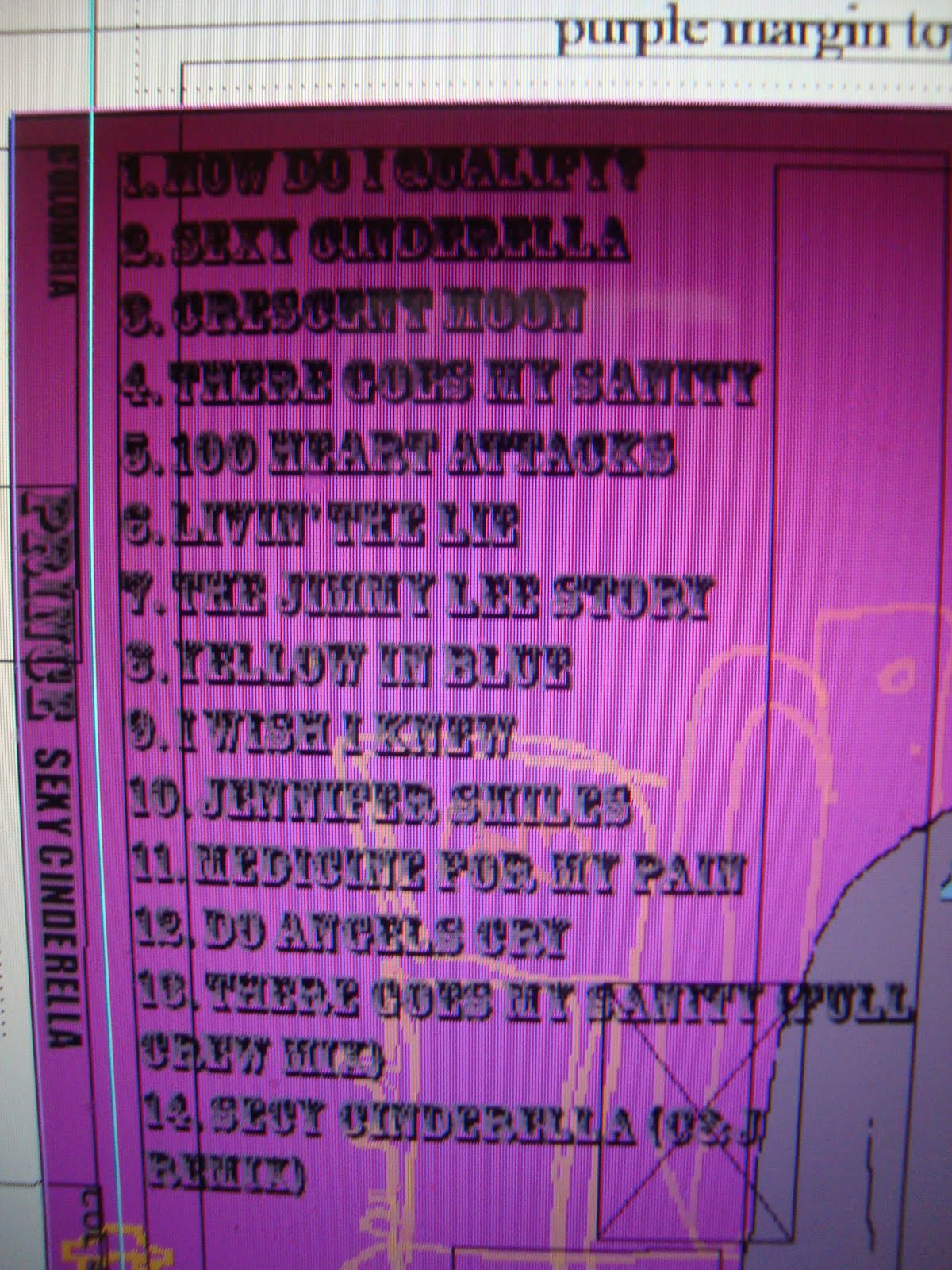
CD BOOKLET:


CD BACK COVER:

POSTER:


For my ancillary products and my final tasks, I used the same fonts for example all three products were written in the same style. The track listings on the back cover and the artists name, the itroduction of the artist
in the main task were done in the same font to show the link. The fairy tale narrative links to the animated album and poster because the are all based on a cartoon. I wanted to keep the story like theme going.


My target audience was young people male and female between the ages of 18-25. They would be a crowd that prefer R'n'B especially, the would be the crowd that prefers to buy albums rather than down load the music from the internet. They would prefer a music video that consisted of love, comedy and drama instead of a music video that contained violence. My target audience would be a crowd of people who liked buying posters. For an album cover they preferred one that had animated pictures and had a variety of pictures and colours. My target audience usually watched their music videos on tv rather than watching them on the internet. Lastly they preferred posters that showed the artist posing which promotes their album and that is very colourful. My final products represented them because it was youthful and attractive. The scenery th I had scenery that chosen reflected them because it was in he middle of croydon. Young adults of that age are into r'nb and sensual music. My target auhe events that had taken place audience could relate to the events that had taken place because they had all been in the same situation before. For boys, they had failed to get the attention of a girl and for the girls they had been persued by a young man before. My ancillary tasks were modern and it reflected the personalities of my target audience. My target audience were happy with my final products because it offered them a change in terms of narrative. My main task wasnt about a happy ending, it was about the protagonist losing. It presented the audience with a music video that wasn't about sex and drugs but it was about love.

Below is what my final version of what my music video looked like: 


WEEK 23 and WEEK 24

For these past two weeks I was redrafting my ancillary task 2. I decided to add the logo's of well known record labels and writing the 'rights to reserve' at the bottom of the poster. I then went back into Adobe Illustrator and added the details to the artists shirt for example I added a collar to his shirt and a few buttons. I then moved it into Indesign and made a new layer. In that layer I created a text box and wrote what I needed to write in the bottom of the poster. I did this because In some of the posters I studied the record labels that the artist were under were mentioned and I wanted my poster to look as realistic as possible. From my audience feedback I learnt that the more detail that I applied to my poster the better it would look and they were right.

WEEK 22


For my ancillary task 1 I did not make that many changes to it. For the CD booklet I just inserted the artists name at the top of the front cover which said 'Prince' I chose that name because I wanted to link it to the original Cinderella story where the prince chases Cinderella, it keeps the narrative going.
The font I used was 'Rosewood std' this was the same font that I used for the back of the CD cover and my main task where the artist is being introduced. I also used this font in my ancillary task 2. I did not want to have another continuity problem as I kept the fonts the same throughout my production stages.
To put the title on the front cover I had to use Adobe Indesign by making a new layer and using the text box to write 'Prince'. I then switched the text boxes so that I could switch the track listings around.

WEEK 21

This week I redrafted my main task and started to draft my evaluation. In my draft for my evaluation I will take pictures of my Sony Cybershot camera, put videos on it from YouTube and print screen images from the PC that I was editing my main task on. I will also put in pictures that I will take from google in it. My evaluation will contain most of the things that I had been working on for the last 25 weeks. It will explain my intial ideas and how I brought these ideas to life. It will explain how my main task and ancillarys challenge the main conventions of real media products. I will write about how I had been able to create three post modern products. Through out my production stages of all three tasks I have asked for audience feedback. Some were positive ans some were negative, I used this to my advantage because it allowed me to create better pieces of works.

My tasks were all affective as a combination because each task promotes each other. My main task helps to advertise the artist and creates entertainment for the audience. The CD booklet helps to promote the artist and his work and the poster helps to promote the ancillary task 1 and the artist. I re-drafted the beginning of my music video. I added parts to the beginning, I added 4 blank screens and attached font to them. I using the sliding effect for this so each clips slid into the other. The first slide said 'Colombia records presents...' this made my music video look more realistic. I had seen this being done in many music videos that I had seen whilst watching tv at home. Most music video's introduce the artist and the record label.
http://www.youtube.com/watch?v=4Ny-il7Cy8A&feature=relmfu
I also added special effects throughout the main task for example in the middle of the music video the is a birds eye view shot of Cinderella walking, used a fade to transition this part into the next part. I had a continuity problem when it came to the artists clothing so I decided to use a story telling narrative during the cut scenes where the boys are on the phone.


This kept the narrative going and also the theme of story telling . It also made the audience laugh when they read this.

Presentation Feedback

Main Task
(music video; film trailer; local newspaper; short film; tv news)

 My ancillary task 2 is not as good as my ancillary task 1. This is because the colours blend in too much, there is not enough text and there is not enough detail on the artists shirt. I need to add more to my anillary task 2 in order for it to match the standards of my ancilary task 1. The overall layout of my ancillary task 2 was well thought out and the fact that I used the same images on the poster as I did in my album cover show that I have shown that there is a continuity going on to show the link in all of my tasks.


Presentation
(Clarity & Control, Key points, Analysis (of creative process), Visual Appeal, Overall Impact)

My presentation is nearly complete, I was able to speak about my ancillary task 2 very clearly and I was
able to explain the concept behind it and why I chose to design it and create it how I did. There is n equal balance of pictures and texts which allows the audience to see how much my work has progressed over the last few months.


Blog/Evaluation
(Target Audience, Decision-Making, Semiotic Analysis, Multimedia, Engagement)
My blog is now has a fully detailed account on how I made my final products. There is a varied range of multimedia such as videos, pictures and even photographs.


Sunday 10 April 2011

WEEK 20

During this week I submitted the draft of my ancillary task 2. My ancillary task 2 challenged the forms and conventions of an R'n'B poster that I found o Lynden David Hall on Google. My poster had the artist posing on the front just like Hall in his poster. However Hall's poster is simple and only his name was on it. On my poster there is a lot more going on. I had placed different images on my poster and I used more bright colours. Halls poster was very dull and unattractive. For my audiencve feed back that I got I was told that my ancillary task two was good but it needed alot more work. It didn't match the standards as my ancillary task 1. When I redraft it I am going to have to add more detail to it.I think that I will put the record label to the poster and I will also add more detail to the artists shirt by putting buttons on it.
All of my tasks are post modern in the sense that they do not take on the traditional role of typical media products. I have kept the fonts and images the same throughout my productions of the ancillary's and I am using the same ideas of using the red dress that Cinderella is wearing in both my main task and my ancillarys.

WEEK 18 and 19

In these two weeks I was back to using Adobe Illustrator but this time I used Adobe photoshop to create my media product. I followed the simple steps that I used in week 14 and week 15.
1. I imported my images from 'my pictures' and into Adobe Illustrator
2. I made a new layer and deleted the original images.
3. In the tool properties I clicked on the pencil tool (using the Wacom tablet) and used it to draw around the imported image to make sure that all the gaps were filled in.
4.I coloured my image with the paint bucket tool.
5. I went to Adobe photoshop and created a new page and made it an A3 page.
6. I chose a lilac colour for the back ground (making a new layer for this first)
7. I created a new layer and imported an illustrated picture that I had created before and placed it on the right hand side.
8. I made a new layer and placed to rectangles on the poster, making one verticle but a bit diagonal and making one verticle. I then used the paint bucket tool to fiil them in with a darker shade of purple.
9. I made a new layer and then I imported the swirls that I had created earlier, placing them all of the page.

10. I then Imported the image that i had recently illustrated, but before that I put sunglases on my artist so that there was a link between that and my cd cover.
11. Imported a glass slipper into Illustrator and used the penvcil tool to draw around it. I then deleted the original.
12. Imported that picture into photoshop and put it on the right hand side next to the picture of the artist.
13. I then created a new layer and opend a text box onto the verticle rectangle on the left hand side. In that I wrote the artists name 'Prince' in it using the same font as the album cover which was Rosewood std.
14. created a new layer and made a new text box for the release date for the album. Once again I used Rosewood std.
15. I created a new layer and imported my hand writted 'Sexy Cinderela' title that I made for my album cover.

From my audience feeback I learnt that my poster was very plain and needed a bit more work but it was good because I had used a range of media programmes in order to create this media product. They liked the idea that I incorperated a glass slipper which linked back to the original story. I just needed to add more the this in order to improve it for example give the artists shirt more detail.

WEEK 16 and WEEK 17


This week started to do research on r'n'b posters for my ancillary task 2. Seeing as I used Kanye West's animated type of images for my cd booklet and back cover I decided that I wanted to keep the illustrated stayle the same just so that my ancillary 1 linked to it too. My media product would challenge the forms and conventions of media products because most r'n'b posters are either plain and simple or very sexual and tasteful. The above pictures are some of Kanye West's recent animated posters. Just above is a piece of artwork by pop up artist Andy Warhol. Most of Kanye Wests' poster are never in the same genre of art, it varies. I wanted to try and vary the styles of my ancillary tasks but I decided not to because then there would be no link between them. Below are some of the typical conventions of an r'n'b poster.
As you can see these male artist are dressed in sophisticated clothing and are staring directly at the audience which is allowing them to feel engaged. I decided to put my artist in a shirt and sunglases just like my front cover. When I asked for feed back I was told that I should try and link my ancillary's together as much as possible. I was also told that my album cover, poster and music video were all post modern because they go against the traditions of typical media products and that no matter what I did to these products all three tasks would still be linked.


WEEK 17
Presentation Feedback

ANCILLARY TASK 1
(music video; film trailer; local newspaper; short film; tv news)
 The audience like my ancillary task 1. The said that it was very unique and that it was different from the rest because everyone in the class decided to use Adobe Illustrator to create my pictures instead of just using original photographs and editing them with Adobe Photoshop. They like the fact that I had kept the theme of Cinderella and the whole story like narrative going. By using cartoon pictures it showed that I was trying my hardest to link my ancillary to my main task. They said that I should neaten up my pictures a bit more because the looked a bit messy.


Presentation
(Clarity & Control, Key points, Analysis (of creative process), Visual Appeal, Overall Impact)
 My power point presentation is nearly complete. The audience could see how my work had developed over the past week and how much my skills had developed too. The could see how I had transformed ordinary photographs into animated products and they were impressed. I was able to explain to them how I had created my illustrated works using a Wacom tablet. I was also able to show them how it was linked to the main task which was also very good. They were impressed with how much research I had done too.


Blog/Evaluation
(Target Audience, Decision-Making, Semiotic Analysis, Multimedia, Engagement)
My blog looks very impressive and I have been able to put how I had created my ancillary into a clear account using pictures and a step by step process. I am starting to feel proud of my work and how well I have been able to develop my ideas more and more as I have gone along. My target audience have been very pleased with my blog because they feel that I have evaluated my work so far very well through pictures. It allows them to see how much work I had put into creating my ancillary task 1. It has also allowed them to see how I have made links to other artists works such as Kanye West and Usher.


WEEK 15


This week I managed to finish the last two pages of my cd booklet and also finish the back cover it too. The last two pages I put together contained 3 text boxes on one page and an image and two more texts boxes on the other. I followed the same steps from week 14 and was able to create an illustrated product that I later on used. The picture above was the original picture before I illustrated it. I changed the gilrs clothing by putting her in a red dress just like Cinderella and taking away her hood and replacing it with long black hair. This links to my main product because they are doing a sexy pose which is found in most r'n'b covers or booklets. Most male r'n'b artists are seen with sexy women.


I copied the writing on the back cover from Nas's 'Nastrodamous' album. I then put record label trademarks on the back that I was familar with.


By adding the record labels onto the back, it made my media product look more realistic. From audience feedback I learnt that my product looked very colourful and even though it was animated it was still suitable for my 18-25 target audience.

I then moved onto creating my cd back cover using the template that I had downloaded from moodle. This task was quite easy because I was very skilled in using the Wacom tablet for illustrating  and creating new images with it too. For my back cover I wanted to fill up most of the space but still make it look simple. I descided to create a handrawn picture of the artist and put the list of the tracks next to him and have a small paragraph of the legal rights and images of the record labels on it too. I used the same purple background as the cd booklet and then put my handrawn image on top. I then went back to Adobe Illustrator and created a handrawn image of the artist. I filled in the artist clothing with purple and blue to keep the purple theme going. I put the barcode at the top of the back of the cover and then on the side margins I put the name of the artist and the name of the album on it. I used the same font that I used on the album cover and within the cd booklet which was Ariel bold and Rosewood std.